EXPLORE TIDEPOOLS
Informational Brochure
Concept Project
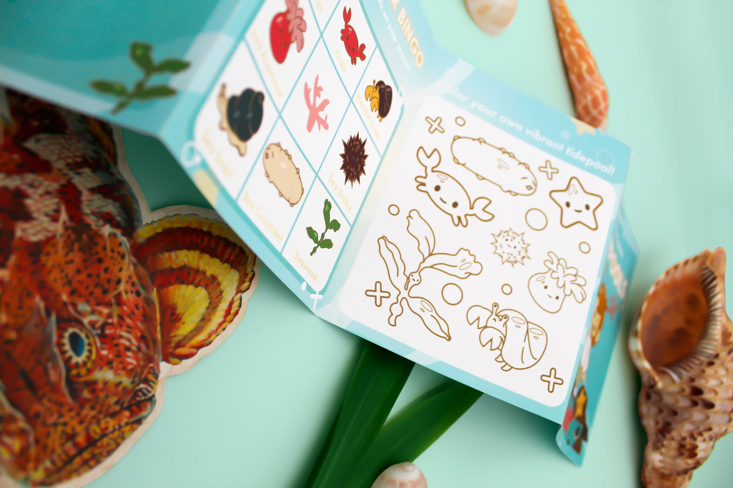
Overview
The focus of this project was to create an informational brochure for children ages 5 to 8. The project had to have a step by step guide within the brochure while the outside had to have an activity related to the project's subject. I decided to create an informational guide for children to learn about etiquette when visiting tidepools, and it's environment. The subject was chosen to encourage children to enjoy outdoor activities, and to understand the importance of marine biology.
Solution
I decided to create an informational guide for children to learn about etiquette when visiting tidepools, and learn about it's environment. The inside contains steps on what you should and shouldn't do when visiting tidepools. The outside has a coloring page, a writing activity about their trip, and an animal guide/ bingo game. The goal of the book is to educate them with the proper etiquette to help them stay safe and have fun, while preserving the tidepool ecosystem for years to come.

Research
For this project I wanted to focus on the audience type and how children react to learning. I researched how children learn and the association of text accompanied with imagery when understanding information presented to them. I found that bright colors, images with text, and emotional faces allow children to retain more information. I also kept in mind where this brochure would be presented and given away at and found that aquariums have activities for children and teachers when visiting. I researched printed activities that popular aquariums feature on their websites, such as Monterey Bay Aquarium, and Long Beach aquarium.
Aquarium Activities

Design Guide


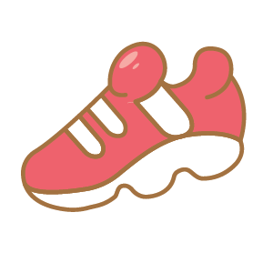



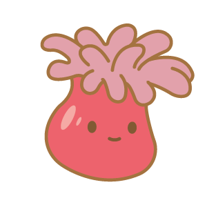



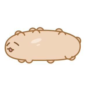
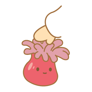
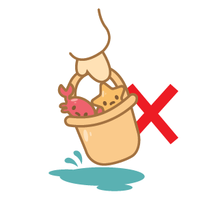

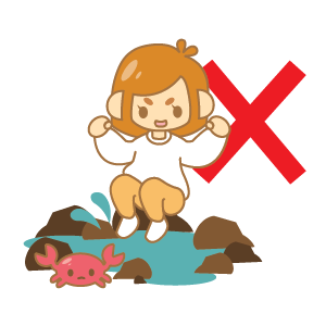
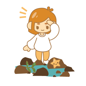
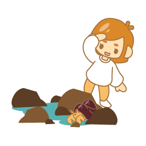

Branding Guide
Icon Scheme
Icons on Colors
Use Background colors that are light and have tints. Using blue for the background must be either lighter or darker than the blue color palette used in the icon displayed. Avoid using bright colors and red.
Good Color Palettes


Bad Color Palettes


Type Misuse
It's important that the type is clear and legible for children to read. The type should not be manipulated in any way. This is to make sure that the child is able to associate the directions with the actions that are presented next to it.
Don't tilt or rotate the icon's type.
Don't put the type behind the icon.
Don't change the type face of the icon.
Avoid
Don't change the icon's color palette.
Don't stretch the icon.
Don't get rid of the outlines around animals, objects, and the character.
Don't put the red "x" over the icon.
